-
-
The item called Data Access represents a simple way to access Historian data. The workflow is usually as follows:
-
Find the signals that you're looking for
-
Configure the time range and data transformations
-
Display charts or export data via files
-
-
-
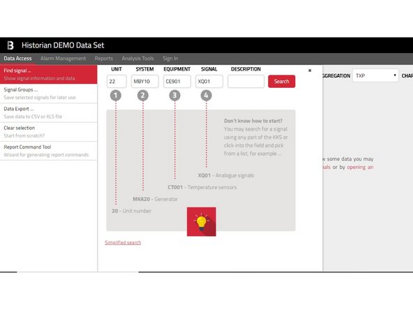
Find the desired signals. In the page Data Access click the left menu item called Find signal, which opens a new panel.
-
You will probably need to narrow your search result using the integrated filter by specifying signal Unit/System/Equipment/Signal or part of the Description.
-
-
-
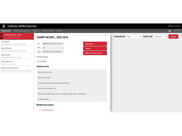
Selected signals are presented at the top of the left menu. You may add as many signals as you want.
-
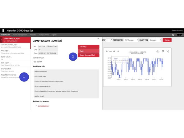
At any time, you may get more information about selected signals by clicking their item in the left menu, which opens a panel with detailed information about particular signal.
-
-
-
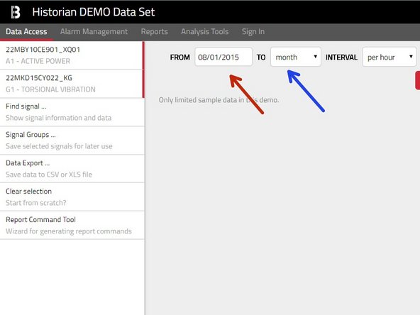
The range can be provided either relatively – by specifying a FROM date
-
Select one of predefined ranges (day/week/month/year/etc.) or absolutely – by picking custom range and specifying exact FROM&TO dates.
-
-
-
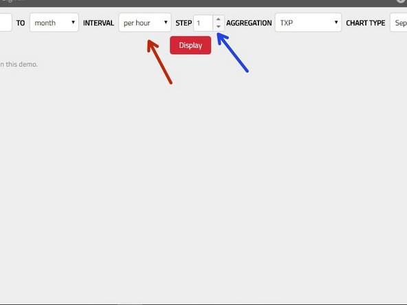
Now you need to decide whether you want to see the RAW data ( by picking RAW in the Interval dropdown) or some aggregated data (selection Per second/Per minute/Per Hour/Per Day).
-
If you have selected any form of aggregation, you can also configure the aggregation step (Interval Per Minute with Step 30 means that you will get value for every 30 minutes)
-
-
-
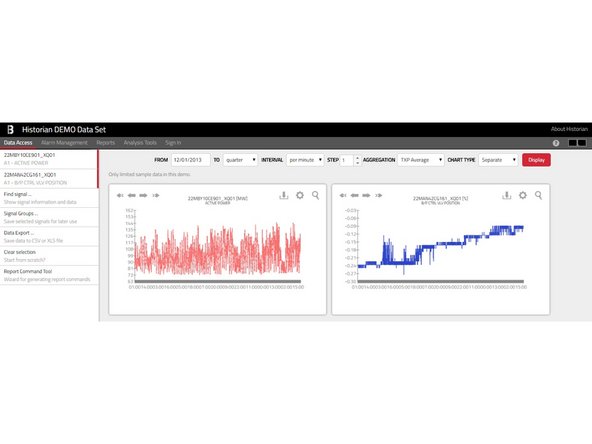
You may view your data inside Historian charts. This is done using the Display button , however you may want to select the Chart Type in advance).
-
Separate Charts: A separate line-chart is shown for each individual signal.
-
-
-
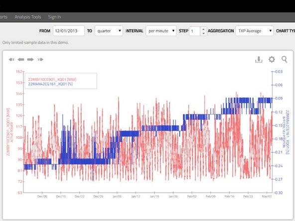
Joint Chart: Shows one line-chart for all selected signals and therefore allows a direct comparison of the values.
-
You may select up to five signals in order to have a separate axis for each signal. If you select six or more signals, they all will be shown, however using one joint axis only.
-
-
-
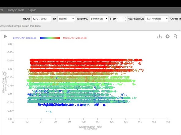
Point Chart:This typically requires selecting two signals (one for horizontal and one for vertical axis with point color based on the time range) or three signals (where the point color is based on the values of the third signal).
-
Point Charts are a great way to spot relations between signals and trends in long-term. You can also start an interactive animation by pressing the play icon in the top left corner to see how the values change over time.
-
-
-
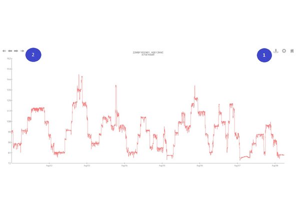
1- Using the buttons in the top right corner , each chart can be: • downloaded as PNG image • customized • switched to full screen view.
-
2- When using Separate or Joint charts (not Point-Charts) you can also jump to different time ranges simply by clicking the arrows in the left top corner.
-
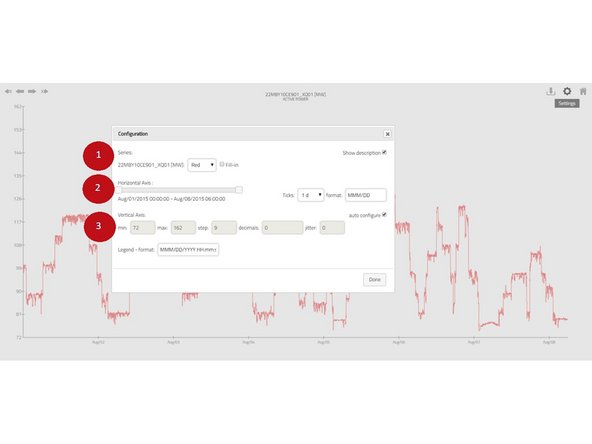
The chart appearance can be customized using the configuration dialog. Based on the chart type, you may change: (1) series color; (2) time axis parameters; (3) numerical axis parameters.
-
Jitter allows small random shifts in values which may be handy for example if you have multiple points sharing the same position in chart.
-
-
-
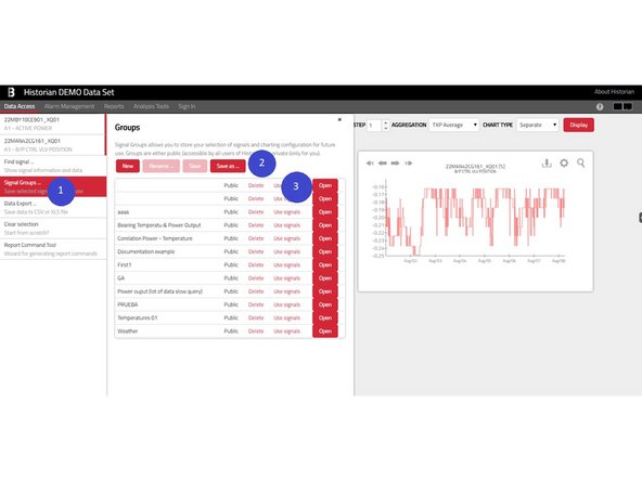
Panel Signal Groups (1) allow them to store their selection for a later use.
-
This can be done by clicking the Save as button (2) and providing a unique name for the group.
-
You can get back to any group by clicking the Open button (3). Or you may only pick signals from this group and add them to your selection by the Use signals button.
-
Group can be also deleted by the Delete button, however keep in mind that deleting a public group will delete this group also for other users. If you have an opened signal group, you may also Rename the group or duplicate the group using the Save as button.
-
Please note, that the Signals Groups usually maintain also the time-range configuration and chart settings.
-
-
-
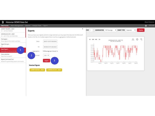
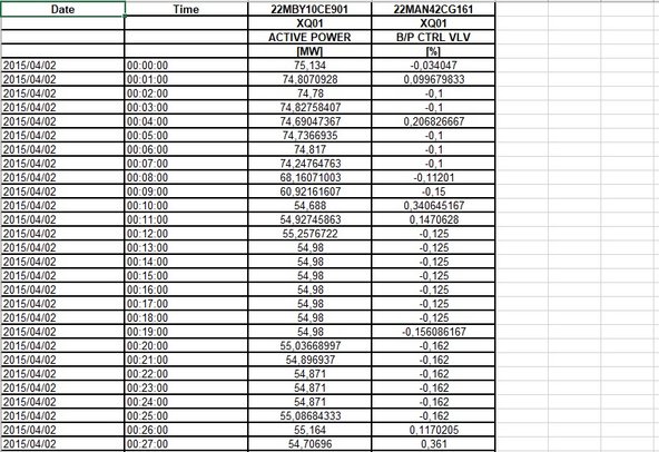
The export panel which opens under the Data Export menu item (1) summarizes the export parameters - list of signals, aggregations, file format (2) - and allows a precise specification of the time range (up to the seconds).
-
These files can be either in CSV (so-called Comma-Separated Values format) or native XLS format.
-
The export is started using the Export button (3). Large exports might take a while to process.
-
Please note, that multiple signals cannot be exported at once in the RAW format. You may export them one after another or at once using some aggregation function.
-
-
-
You can open this tool in the Data Access tab by clicking the Report Command Tool either in the main left menu (1) or in the detail of each selected signal (2).
-
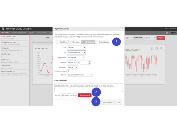
Once you’re in the dialog, you can choose the expected result (1). You might want:
-
Date & Time (e.g. to put current date in some particular cell)
-
One Value – one number of a specified signal at some moment of time (e.g. number of operation hours at noon)
-
List of values – multiple numbers of one signal (e.g. average temperatures per hour during the day
-
Totalized value (e.g. burned gas during last 24 hours as calculated from gas flow)
-
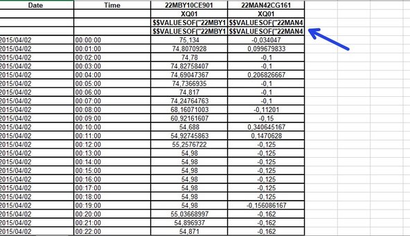
Once your formula is set, you see its exact syntax in the Excel command field and you may let Historian to evaluate the formula using the Test command button (2). You may use the Copy to clipboard button (3) to copy-paste your formula into your Excel template.
-